XHYPE®
Brand Guidelines
XHYPE believe in the power of a strong and consistent brand presence. Our brand is not just a logo; it’s an embodiment of our values, culture, and the promise we make to our audience. These guidelines serve as a compass, ensuring that every interaction with our brand is cohesive, memorable, and true to who we are.
1
The XHYPE Story
In the world of automotive performance, every drop of lubricant is a testament to our legacy of innovation. From race tracks to street drivers, our products have powered the machines that push the limits. This narrative, embedded in our products, now extends to the guidelines that steer our brand identity. It’s not just a story; it’s a legacy of excellence in motion.
Whether you’re a designer shaping the next label or a marketer crafting a campaign, these guidelines are your roadmap through the performance landscape. They encapsulate the colours, typography, imagery and messaging that embody the power and efficiency of our lubricant products. Use them to steer your projects, ensuring they seamlessly align with the high-performance standards our brand upholds.
2
Colours
Turbo Navy
- HEX
#01003B - RGB
1 0 59 - CMYK
98 100 0 77 - Pantone
289C - Automotive Paint Code
HMG Pro Range SC601 HMG Colour BOX BL 0932 Blue
Neon Green
- HEX
#16E5EB - RGB
22 229 235 - CMYK
91 3 0 8 - Pantone
311C - Automotive Paint Code
HMG Pro Range SC601 Pantone 311C Light Blue
Ice Grey
- HEX
#F7F9FA - RGB
247 249 250 - CMYK
2 1 1 0
3
Logo
Primary Logo Turbo Navy
3.1
Logo usage
Logo usage depends on the background, application type and available space.
If you are unsure on how to use our brand, see examples below or email support@xhype.co.uk.
3.2
Logo with slogan
4
Typography
Our typefaces are handpicked for maximum visibility and brand awareness. Users absorb information, follow instructions and complete tasks primarily through reading text. It is important to use good typographic principles to establish a visual hierarchy and present content as clearly as possible.
Web
For on-screen communications. See heightachy example in this heading between header and body text.
Headline font
Futura
Weight: 900
A B C D E F G H I J K L M N O P Q R S T U V W X Y Z 123456789@!ӣ$%^
Body font
Rubik
Weight: 600
A B C D E F G H I J K L M N O P Q R S T U V W X Y Z 123456789@!ӣ$%^
TBC
General typesetting guidance
Paragraph spacing
Spacing between paragraphs should be of equal proportion throughout. The final paragraph at the end of a section of content should be followed by double the amount of space used between paragraphs. This shows that the section has come to an end and the next section contains information on a different topic.
Case setting
All text should use sentence case. Sentence case involves capitalising only the first word and any proper nouns in titles, chapter, and section headings. Product names eg FLUX, NEO, ECHO and XHYPE are an exception and should be capitalised.
Alignment
Content should always be aligned to the left hand-side of a page. Do not fully justify your content as it is harder to read.
Styling
Bold, semi-bold and the use of colour can be used to highlight specific areas of text when required but cannot be solely relied upon to show importance.
5
Media
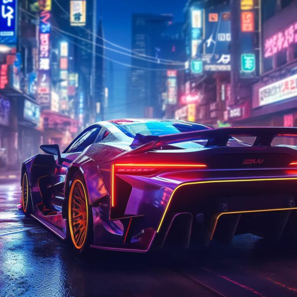
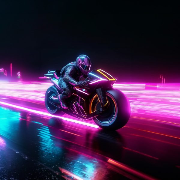
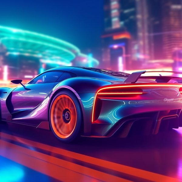
Our AI photography is bespoke for XHYPE. You can browse and download images from our Media Portal.
6
Trademarks
Our official and approved registered trademarks
